
I’ve owned “Watchmen #1” since the day it came out, or close to its release date in September of ’86. It’s spent most of its life bagged but not boarded. The spine is still crisp, as are the edges. It lies relatively flat, and the color seems good. Maybe slightly dimmer.
I think I’ve been lugging this thing around since “Oprah” premiered during the Reagan administration and the Iran Contra hearings. Maverick and Goose, Bueller and Aliens heralded the big screen. And it was Halley’s Comet and the Space Shuttle Challenger disaster in our upper atmosphere.
Before, during, and after my high school years, I purchased comics from a monthly subscription service called Westfield Comics. Us collectors thought #1’s and specific issues would be worth something sometime in the distant future. If I was able to keep them out of the rotting attic box I fashioned, I may one day find myself sitting on a gold mine as a proud owner of the next big collector issue like “Superman #1” or “Amazing Fantasy #15” (Spidey’s first introduction). So I bought Watchmen #1.
I barely remember it being delivered, but as time passed, I felt I should get to reading the thing because there was already a growing buzz about it. But I never did. And if I’m being honest, “Watchmen” never quite landed with me. I didn’t get it. I couldn’t get past the cover and the flip-through. The pages seemed boring, even cheesy. Not exciting enough for this die-hard Spidey fan.
Over the years or decades, I began a slow realization that “Watchmen” served as a sort of springboard for alternative comic narratives and independent publishing, similar to the ways punk and grunge did for music. It was like Nirvana’s “Nevermind,” pushing cookie-cutter template models out in exchange for new ideas, new stories told from challenging human perspectives. The characters were darker, more complicated, and troubled. These heroes were not the squeaky cleans of Superman, Spiderman, Captain America, etc. It’s not like Spidey didn’t have his fair share of daily life troubles. And Batman was certainly known for his brooding shadow-lurking, as was Daredevil and Hulk’s tortured anger. But this comic was on another level.
The “Watchmen” narrative became the gateway comic for others who sought to challenge conventional comic book storytelling and hero conception. Thirty-five years later, after finally having read the graphic novel, is when I began to see the draw.
This comic, adorned on the cover with a happy yellow smiley face, came smeared with a bloody bullet hole between the eyes. Set in an alternative 1985 where the existence of superheroes—especially the godlike Dr. Manhattan—have changed politics, science, and society, leading to a U.S. victory in Vietnam, Nixon’s extended presidency, the Cold War, technology like electric cars, and a media dominated by paranoia, and sensationalism rather than traditional superhero worship.
In this realm, writer Alan Moore created his brave new vision. He argued that comics require more imagination and active participation from the reader than watching a movie. He stated that, “Comics are closer to poetry than to film. You can control how the reader experiences time in a way that film simply cannot.” Artist David Gibbons’ design perfectly complements that pacing and symmetry as viewed in the unique visual structure, in which the use of color suggests a heightened sense of alt-reality. There was a strict adherence to structured 9-panel paneling and the use of repetition and symmetry to maintain a strong sense of pacing.
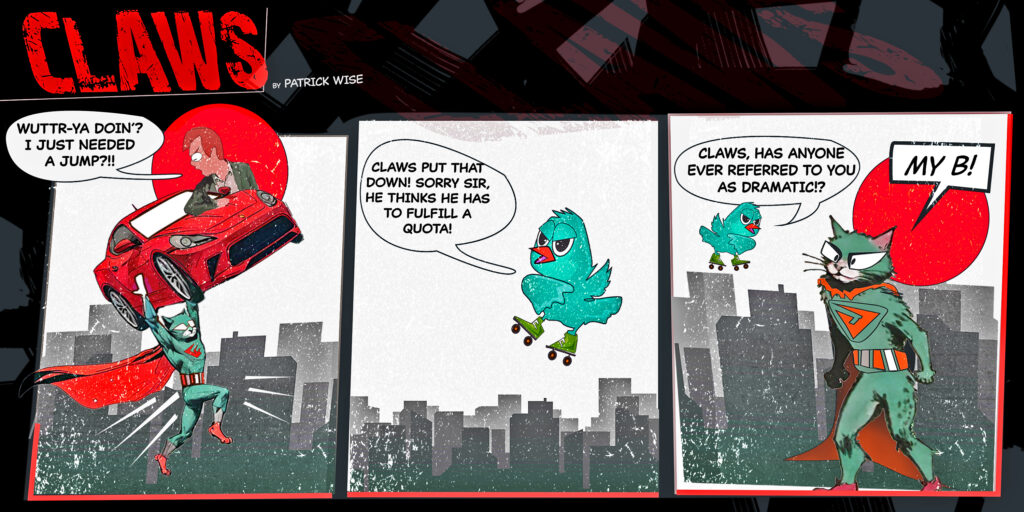
These are the types of cues I look for in art, design, film, and music. I crave a thoughtful approach to the bending and shaping of elements redistributed in a manner to communicate a mood. So, with this relic sitting in my collection, “Watchmen” reminds me of when comics were evolving, a testament to the power of design and storytelling but, most importantly—craft. It stands as a challenge. Maybe if I’d given it a chance earlier, I’d have understood why it resonates so deeply. For now, I’ll continue to examine and take inspiration from its style to incorporate into my own design each week, as well as in “Claws.” See the repetition and stricter adherence to panel shape and size in this week’s 3-panel, Episode 9.
Pat Wise is the graphic designer at the Mountain Times and creator of the “Claws” comic.
This Week’s Claws