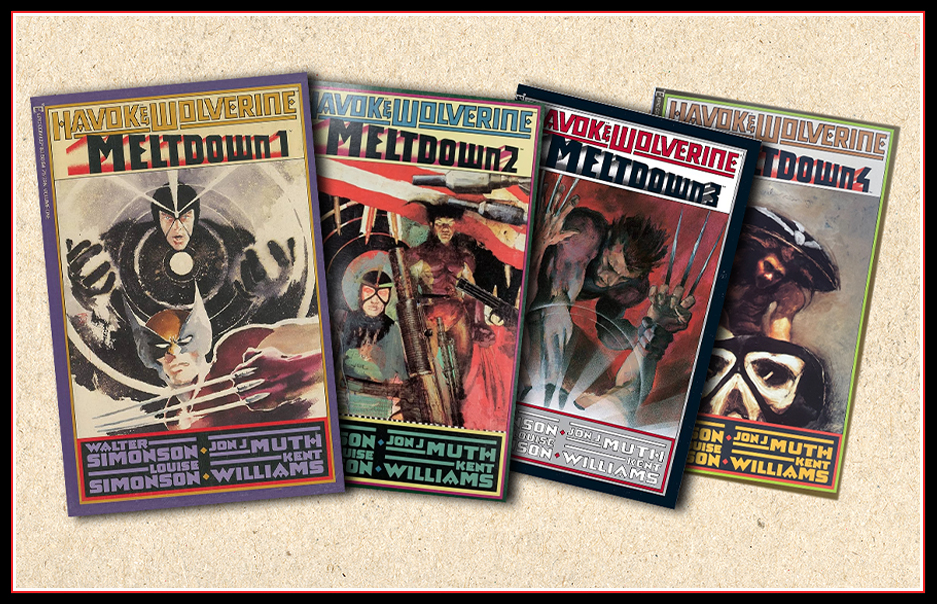
Last week, I revisited the style of “Watchmen,” a masterpiece that took me 35 years to appreciate fully. This week is a graphic novel that struck me immediately, and it has served as a standard by which much of the art I appreciate is measured: “Havok & Wolverine: Meltdown,” written in 1988 by Walter and Louise Simonson, with artwork by Jon J. Muth and Kent Williams.
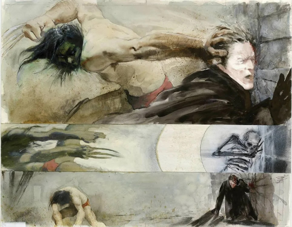
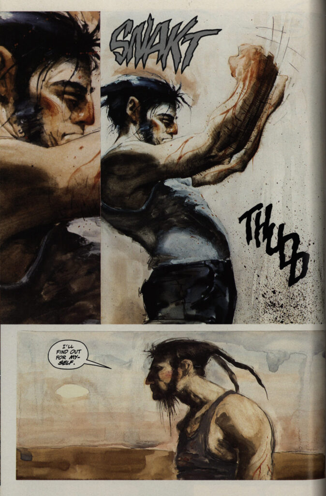
This graphic novel depicts Marvel’s Wolverine and Havok in a post-Chernobyl disaster setting. Its paneling and art style were unlike anything seen in its time. Muth drew the Havok scenes and Williams the Wolverine scenes. This dynamic is interesting.
The art abandoned the rigid precision of line work and inking of traditional comics in favor of wild expressionism, complete with strokes of raw energy and composition that defied strict line adherence. It seemed intentionally chaotic, so the expressionistic flair would function to mesmerize.
A world in decay
Reading “Meltdown” felt like stepping into a “Mad Max/Road Warrior” wasteland with its environment of corroded machinery, rusted bolts, and oil-slicked remnants of human ambition. The artwork evoked the same industrial ruin captured by Russell Mills on the album cover of “The Downward Spiral” by Nine Inch Nails. Mills used rusted metals and distressed textures to create a visceral sense of decay, much like “Meltdown” does with its barren, muted sepia tones, soft browns, beiges, and faded oranges, creating a warm, vintage feel. The subtle palette adds textured depth and nostalgia, giving the artwork an almost ethereal atmosphere. Even the album’s lyricism—a raw scream of self-destruction and entropy—could serve as this dying world’s lost, gasping voice.
Echoes of J.M.W. Turner
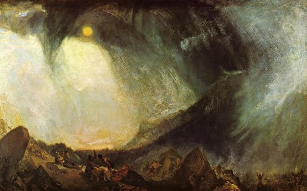
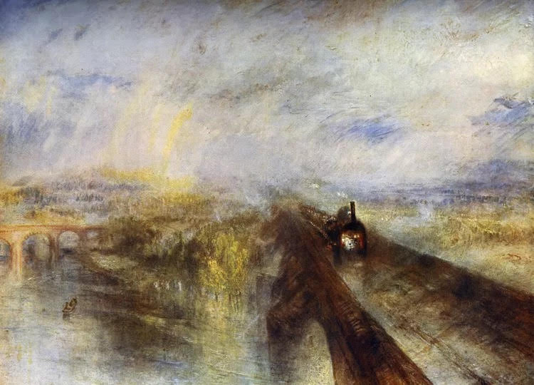
What truly caught my attention was how “Meltdown’s” artistry echoed the works of English Painter J.M.W. Turner. Like Turner, Muth and Williams embraced loose, gestural brushstrokes and blended colors that bled beyond traditional forms. Turner’s “Snow Storm: Hannibal and His Army Crossing the Alps” conveys chaos through swirling earthy tones, contrasted vibrantly against deep blacks and hints of gray, and feeling of spattered tones and blurred lines suggesting erratic, aggressive motion much like sandstorm chiseled textural decay in “Meltdown.” The graphic novel also shares a kinship with Turner’s “The Burning of the Houses of Parliament.” Both works’ blurred line and free flowing strokes convey the landscape as a mood and visual language, immersing the viewer in motion and emotion. Like Turner’s “Rain, Steam and Speed – The Great Western Railway,” “Meltdown” rejects rigid structure in favor of raw movement. Just as Turner blurred the lines of industrial progress, “Meltdown” abandons traditional panel layouts, allowing the story to breathe organically rather than conform to strict grids. This approach makes “Meltdown” feel alive—unrestrained, unpredictable, and immersive.
A visual reimagining for comics
“Havok & Wolverine: Meltdown” is a symphony of visual rebellion—a convergence of postmodern dystopia, industrial decay, and classical artistry. It broke the boundaries of comic art, reminiscent of Turner’s storm-torn landscapes, Russel Mills’ industrial rot, and the chaotic energy of music itself.
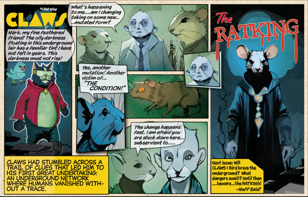
This week’s Claws